Menu Website

- Home
- MediaOutReach
- Watsons Unveils 'Watsons Evergreen' with Pantone to Celebrate 185 Years of Trusted Care and Everyday Vitality

Watsons Unveils 'Watsons Evergreen' with Pantone to Celebrate 185 Years of Trusted Care and Everyday Vitality
Jumat, 24 Juli 2026 | 09:59
HONG KONG SAR -
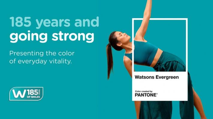
Media OutReach Newswire ' 23 July 2026 - Watsons, the flagship health and beauty brand of AS Watson, today announced the launch of
Watsons Evergreen, as part of AS Watson's 185th
anniversary celebrations. To elevate its significance and create a
consistent and credible expression across markets, Watsons partnered
with the Pantone Color Institute', the world's leading authority on
colour. Combining Watsons' rich heritage with Pantone's expertise, the
collaboration helped define and articulate a global brand asset that
captures the essence of Watsons and its vision for the future.
A Colour That Brings the Brand to Life
Watsons Evergreen is a vibrant blue-green hue that symbolises everyday vitality, care and reassurance, reflecting Watsons' purpose of helping customers LOOK GOOD, DO GOOD, FEEL GREAT every day. As a distinctive visual identity, it creates a shared language that connects Watsons markets worldwide.
From Watsons' logo and store design to merchandising displays, digital channels and Own Brand products, Watsons Evergreen has long been a familiar presence across customer touchpoints. The Watsons Evergreen campaign will roll out across 16 markets, including Asia, Europe and the Middle-East, through a series of customer and community activations, as well as a curated range of products, reinforcing the brand's long-standing connection with customers and communities around the world.
Celebrating a Heritage of Trusted Care
At the heart of the initiative is a simple belief: Watsons has always been there for customers and will continue to be for generations to come.
For 185 years, Watsons has supported customers in their everyday health needs, beauty routines and wellbeing moments, whether in-store or online. Watsons Evergreen reflects this enduring relationship, serving as a symbol of consistency, trust and care in an ever-evolving world.
Jared DeGuzman, Customer Director of Watsons International, said, "For 185 years, Watsons has helped customers feel healthier, happier and more confident in their daily lives. Watsons Evergreen captures that role in a simple yet powerful way. By partnering with Pantone, we've transformed our iconic brand colour into a global symbol of vitality, care and wellbeing that will connect customers across every Watsons market."
Laurie Pressman, Vice President of the Pantone Color Institute', added, "Watsons Evergreen captures the essence of a brand that has stood the test of time while continuing to grow and evolve. It is a colour that speaks of vitality and longevity, and of a deep, lasting connection to the customers and communities Watsons has served for generations."
As Watsons marks this milestone anniversary, Watsons Evergreen stands as both a reflection of its rich heritage and a symbol of its forward-looking vision - uniting past and future in one distinctive expression of the brand.
A Colour That Brings the Brand to Life
Watsons Evergreen is a vibrant blue-green hue that symbolises everyday vitality, care and reassurance, reflecting Watsons' purpose of helping customers LOOK GOOD, DO GOOD, FEEL GREAT every day. As a distinctive visual identity, it creates a shared language that connects Watsons markets worldwide.
From Watsons' logo and store design to merchandising displays, digital channels and Own Brand products, Watsons Evergreen has long been a familiar presence across customer touchpoints. The Watsons Evergreen campaign will roll out across 16 markets, including Asia, Europe and the Middle-East, through a series of customer and community activations, as well as a curated range of products, reinforcing the brand's long-standing connection with customers and communities around the world.
Celebrating a Heritage of Trusted Care
At the heart of the initiative is a simple belief: Watsons has always been there for customers and will continue to be for generations to come.
For 185 years, Watsons has supported customers in their everyday health needs, beauty routines and wellbeing moments, whether in-store or online. Watsons Evergreen reflects this enduring relationship, serving as a symbol of consistency, trust and care in an ever-evolving world.
Jared DeGuzman, Customer Director of Watsons International, said, "For 185 years, Watsons has helped customers feel healthier, happier and more confident in their daily lives. Watsons Evergreen captures that role in a simple yet powerful way. By partnering with Pantone, we've transformed our iconic brand colour into a global symbol of vitality, care and wellbeing that will connect customers across every Watsons market."
Laurie Pressman, Vice President of the Pantone Color Institute', added, "Watsons Evergreen captures the essence of a brand that has stood the test of time while continuing to grow and evolve. It is a colour that speaks of vitality and longevity, and of a deep, lasting connection to the customers and communities Watsons has served for generations."
As Watsons marks this milestone anniversary, Watsons Evergreen stands as both a reflection of its rich heritage and a symbol of its forward-looking vision - uniting past and future in one distinctive expression of the brand.
BERITA LAINNYA
Jumat, 24 Juli 2026 | 10:55

Jumat, 24 Juli 2026 | 10:55

Jumat, 24 Juli 2026 | 10:54

Jumat, 24 Juli 2026 | 10:09
Jumat, 24 Juli 2026 | 10:07

Jumat, 24 Juli 2026 | 10:05

Jumat, 24 Juli 2026 | 10:03
Jumat, 24 Juli 2026 | 10:01
Jumat, 24 Juli 2026 | 09:59

Kamis, 23 Juli 2026 | 13:51
Kamis, 23 Juli 2026 | 13:50

BERIKAN KOMENTAR


-
 Jumat, 24 Juli 2026 | 11:56
Pelindo Dumai Dinilai Tak Mampu Tanggulangi Dampak Lingkungan akibat Penimbunan Dua Anak Sungai
-
-
Jumat, 24 Juli 2026 | 10:55
Dari Meksiko ke Hong Kong, Jose Manuel Cervantes Sanchez Membangun Jembatan Melalui Media di CUHK
-
Jumat, 24 Juli 2026 | 10:54
Shorter Trips, More Meaningful Experiences: OZO Taps into the Rise of Micro-trips Across Asia-Pacific
-
Jumat, 24 Juli 2026 | 10:09
From Mexico to Hong Kong, Jose Manuel Cervantes Sanchez is Building Bridges Through Media at CUHK
-
Jumat, 24 Juli 2026 | 10:07
Singapore's Largest Pet Event Returns Bigger Than Ever with Singapore Pet Festival 2026

-
 Minggu, 19 Juli 2026 | 08:24
Forest City SFZ Releases Updated Tourism Data As Johor Bahru?Singapore RTS Link Nears Completion
-
-
 Minggu, 19 Juli 2026 | 08:37
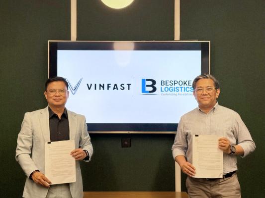
VinFast partners with Bespoke Logistics to strengthen electric motorcycle logistics capabilities in the Philippines
-
 Minggu, 19 Juli 2026 | 08:38
VinFast inaugurates 20 e-motorcycle dealerships in Indonesia, expanding its green mobility ecosystem nationwide
-
 Minggu, 19 Juli 2026 | 08:31
VinFast partners with TUV Rheinland to advance vehicle testing capabilities for Vietnam's automotive industry
-